Easier Navigation for Digital Professionals
The speed of online work depends on how quickly you can find what you need. When apps, websites, or dashboards are simple to navigate, tasks are finished sooner. For content creators, marketers, developers, or project leads across different time zones, every click counts. Clear flow and uncluttered interfaces reduce fatigue and improve output quality.
Summary at a Glance
- Use clear labels and logical menus to make searching faster.
- Promote a “search-first” approach with strong search and command palette features.
- Keep patterns consistent across tools to reduce confusion.
- Measure click paths and zero-result searches to improve continuously.
The Context of Global Work
Teams operate across time zones, languages, and devices. Some work from desktops, others from mobile. Preferences vary between dark and light mode. Poor flow leads to constant context switching, loss of momentum, and missed deadlines. Clear movement supports collaboration across regions, helping projects progress with fewer delays.
Foundations of Quick Movement
Three pillars guide smooth interaction. First, clarity: section names must be easy to understand. Second, consistency: menus, buttons, and dialogs should behave the same across the system. Third, predictable actions: a tab should always trigger the same result, no matter where it is. This consistency removes hesitation and speeds up decision-making.
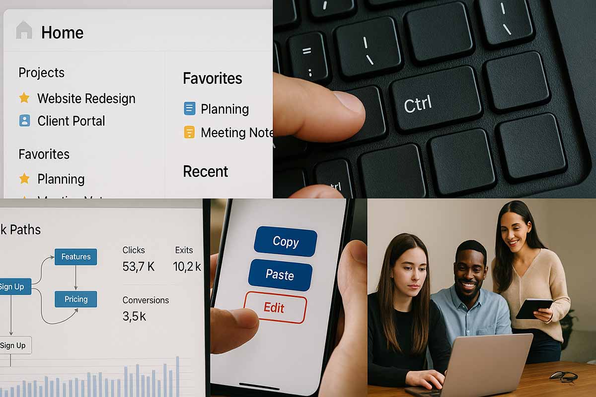
Clear Information Architecture
Structure hierarchy before improving design. Place frequently used items at the top. Separate administrative tasks like billing, roles, and security from daily activities such as posting or launching campaigns. If possible, limit to two menu levels. Avoid hiding key actions deep within layers of clicks. Shorter paths save time and reduce frustration.
Labels Without Guesswork
Flowery or vague wording creates confusion. Use direct terms. For instance, call analytics sections “Reports” rather than something ambiguous. Avoid using similar words for different actions. A style guide helps maintain consistent language across products. When wording is uniform, the brain processes screens faster and with less effort.
Search and Command Palette
For large products, search is often faster than navigating menus. Place the search bar in an accessible spot. Make sure it can find people, files, settings, and actions. Offer suggested queries in an empty box. Power users benefit from a command palette where actions like creating tasks, adding tags, or switching projects appear instantly. Keyboard hints beside each action accelerate performance even more.
Keyboard Shortcuts and Gestures
Many professionals spend hours on the keyboard. Provide key shortcuts for saving, switching tabs, and opening search. A small help overlay can appear when pressing a trigger key. On mobile, use familiar gestures such as swipe to go back and long press for more detail. Avoid unusual gestures that are difficult to memorize.
Breadcrumbs and Orientation
Deep hierarchies can confuse users. Breadcrumbs guide quick returns to earlier levels. Each step should be clickable and clearly named. If filters are applied, show them near titles so users always know what view they are in. This reduces the need for repeated backtracking.
Showing the Right Information at the Right Time
Not every detail is needed immediately. Present the most important content first and add options later. For example, when creating a campaign, start with goals and audience before showing advanced settings. This structure clears the mind and makes decisions faster.
Consistency Across Tools
Work often requires several apps for planning, content, or payments. Different terms and patterns break flow. A shared playbook for naming and icons helps. If “Tasks,” “Reports,” and “Settings” use the same terms across tools, teams adapt quickly. Consistency shortens onboarding and strengthens collaboration.
Mobile and Small Screens
Space is tight on mobile devices. Place the most-used actions in the bottom bar for easy thumb access. Avoid deep nested menus. Use clear icons with labels rather than icons alone. For forms, divide them into smaller steps. Three short steps are better than one long page.
Accessibility as Standard
Interfaces usable by all improve speed for everyone. Adjust text-to-background contrast. Enlarge tap and click targets. Provide a clear focus state for keyboard users. Use aria-labels and alt text so screen readers can interpret content. Accessibility benefits not just a few, but all users.
Language and Localization
Work is global. Text often expands in translation. Layouts should allow extra space. Avoid cramped buttons that break when the language changes. For right-to-left scripts, ensure icons and layouts adapt properly. A system that respects language differences ensures smooth global collaboration.
Data for Ongoing Improvement
Measure movement patterns. Where do users click before reaching important pages? How many searches return no results, and which terms fail? Which labels are ignored despite importance? With these insights, rename menus, reposition actions, or add filters. Small adjustments bring large relief.
Guided Onboarding
New members need clear support without interruptions. Provide a three- or four-step checklist to get started. Contextual tips should appear only when necessary. Sample data helps new users understand flows before real projects begin. Remove tips after the first week to keep screens clean.
Microcopy and Human Tone
Sometimes, words alone speed up flow. Use short sentences. Avoid jargon unless it is industry standard. Error messages should explain what happened and how to fix it. Success messages should guide the next step, such as “Draft saved. Do you want to schedule it now?”
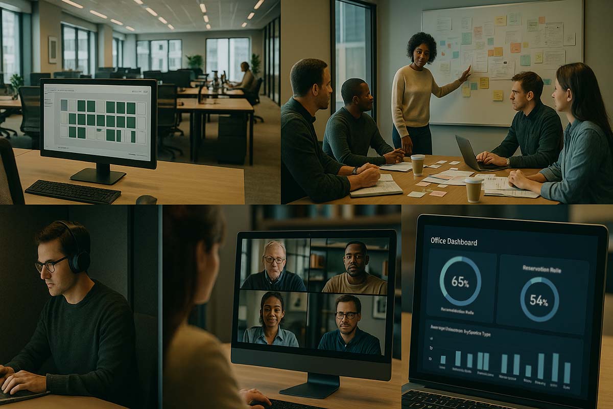
Everyday Examples
A social marketer managing hundreds of assets once needed to pass through three sections to reach the scheduler. The team moved the scheduler higher, added a search bar, and created a shortcut key. Posting became faster, and output increased within the same time frame.
A product manager relied on four tools that used different terms for the same task. The team created a small dictionary of shared terms. New members onboarded faster, and confusion dropped as wording stayed consistent.
A designer who worked mostly on mobile struggled with misplaced buttons. By moving key actions to the bottom and enlarging touch targets, mistakes decreased. More tasks were completed during travel without added strain.
Common Pitfalls and How to Avoid Them
Overloaded features scatter attention. Keep primary views focused on essentials. Lack of feedback after actions creates uncertainty. Provide clear states after clicks. Poor search results discourage use. Fix indexing, synonyms, and zero-result terms. Lastly, inconsistent section names create chaos. Use a style guide and audit quarterly.
Designing Task Flows
Look at the complete path from start to finish. For example, from idea to published content. Identify three critical points: common pauses, frequent mistakes, and time overruns. Place related actions together. If approval is needed, put the button near the reading area rather than on a separate page. Show upload progress and previews instantly.
Supporting Different User Levels
Not all users share the same depth of expertise. Beginners need simple guided paths. Experienced users need shortcuts and command palettes. Experts need access to API documentation and deeper search. By serving all levels, the workflow improves for the entire team.
Maintenance and Fast Iteration
Improvement does not end at launch. Create small rituals. Each month, fix quick wins like renaming confusing labels or moving a misplaced button. Each quarter, run a 30-minute remote test with three people from different countries. The short investment returns significant value.
Security and Trust Without Burden
Flows must be secure but not heavy. For sensitive actions, use clear confirmations that are easy to read. Avoid long technical explanations. Explain limits briefly and state the next step. Transparent policies encourage compliance without slowing work.
Choosing the Right Level of Detail
Some professionals want summaries, others need full details. Offer both. In list views, show key metrics. In detail views, include all options in an organized layout. Both views should align, and switching between them should feel seamless.
Building a Culture of Clarity
Interfaces matter, but so does team culture. When everyone asks, “How can we make this faster,” delays shrink. Sharing small tips like shortcuts or better folder names spreads efficiency across the group. This culture creates a professional environment that feels lighter and more effective.