Picking Visuals That Fit Your Brand
Creating a Consistent and Professional Impression
Choosing the right images, colors, and layout builds a clear personality for your brand. Whether it’s a website, social feed, or printed pitch deck, clients and peers in a coworking environment see a message that feels consistent and professional. In a fast-moving world, every pixel counts. A single glance can help build trust and spark meaningful connections. To enhance visual elements, you might also consider using design tools or assets such as an arrow png to guide user focus.
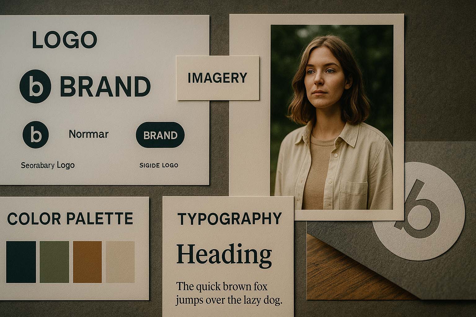
• “Visual fit” refers to the harmony of color, typography, imagery, and design that reflects your brand voice.
• When these elements work together, your company becomes easier to recognize and remember across the globe.
• Clear steps are needed: define your brand personality, select a color palette, establish guidelines, and use data to refine your approach.
Visual fit means choosing design elements that strengthen your brand story. A nice photo isn’t enough. The full visual identity must match the tone of your business. Think about a fintech app—minimalist lines, clean fonts, calm tones. Now compare that to a brand offering plant-based meals—vibrant colors, lively imagery, warm design. Their personalities differ, so their visuals must reflect that difference. Designers often integrate subtle visual cues like an arrow png to reinforce brand direction and engagement.
How Visuals Influence Brand Recognition
Research shows that nearly 90% of buying decisions are influenced by color and design. Using the same color scheme across platforms builds memory cues. For example, many associate green with Spotify and red with Coca-Cola. In the coworking industry, brands like WeWork and Mindspace are quickly recognized through warm tones and open spaces. When your visuals match this level of cohesion, your brand becomes easier to recall worldwide.
Start With Your Brand’s Personality
Before picking colors or fonts, understand the nature of your brand. Are you playful and creative like a startup studio? Or serious and dependable like a global consulting firm?
Choose three words that define your brand. For example: “open, innovative, reliable.” From here, you can shape your visual tone. Brands that are open and modern often go with bright colors and contemporary typefaces. Reliable ones tend to prefer muted palettes and classic serif fonts.
Choosing a Color Palette That Connects
Colors evoke emotion. The right mix makes your brand instantly recognizable, no matter the audience’s location. Consider the following:
Blue – calm credibility, ideal for professional services
Green – responsibility and nature, fits sustainable brands
Orange – energy and adventure, works well for lifestyle or travel
Black and White – clarity and elegance, common for high-end tech
Choose 3 to 5 colors with clear roles: one primary, two secondary, and optional accent tones. Always test contrast to make sure text remains readable, especially on mobile.
Typography That Speaks for Your Brand
Fonts are like voices in written form. Sans-serif types like Helvetica or Montserrat feel clean and modern. Serif fonts like Playfair Display carry a classic, prestigious feel.
Limit your choices to two font families to avoid visual clutter—one for headlines and one for body text. Choose consistent weights like regular, bold, or light, and document these in your brand manual. Make sure the text is accessible, readable on small screens, and well-sized for global readers.
Photography That Tells a Story
Not all images work. If your brand promotes work-life balance within a coworking space, select photos with natural lighting, real people, and candid situations—not overly staged stock images.
To stay inclusive, show diverse cultures and genders. Avoid scenes that feel too localized. The goal is to present your brand as collaborative, welcoming, and truly international.
When to Use Illustration vs. Photography
Stylized illustrations shine when you’re explaining something complex, especially in tech-heavy contexts. They help simplify abstract ideas, like using flat icons to show cloud infrastructure.
But when real emotion matters, photography performs better. Mixing both is fine, as long as you maintain a unified art direction. A visual identity should look like one team created it—not a patchwork of random sources.
Being Culturally Aware in a Global Context
Colors and symbols don’t mean the same thing everywhere. In some countries, white is used for celebrations; in others, it represents mourning. Be mindful of gestures and icons too. A thumbs-up might seem positive in Europe but could carry a different meaning elsewhere.
If unsure, stick to neutral symbols. When planning large campaigns, consult with local partners or colleagues to avoid misunderstandings.
Consistency Across Digital and Print
Your visual identity doesn’t stop at the screen. Bring it to life in printed materials like banners, booth displays, business cards, and even member welcome kits.
Create a detailed style guide that includes exact Pantone, RGB, and HEX codes, spacing rules, and logo margins. Store it in a cloud folder that’s easy to access by designers, marketers, and freelancers in any time zone.
Aligning Visual Assets With Your Content Calendar
A good font and a solid palette aren’t enough. You also need a schedule for visual rollouts.
Align visuals with major business events. Let’s say you have a webinar on remote work or a global conference coming up—prepare visual content that matches the tone of those milestones. When your visual identity shows up consistently in cards, invites, and recaps, your audience begins to recognize your brand instantly.
Letting Data Guide Your Design Decisions
Design can be artistic, but data adds value. Use tools like heat maps and scroll-depth trackers to identify which visuals draw the most engagement.
If budget allows, run A/B tests. Try two versions of a hero image with different color overlays. The one with higher click-through or retention wins. Update your brand guide accordingly, and don’t be afraid to evolve your visuals based on what the numbers say.
Practical Setup: Quick Checklist
Define three words that describe your brand’s personality
Choose one main color and two supporting colors
Select two fonts—one for headlines, one for body copy
Create 10 photos or illustrations that follow a single art style
Document it all in a guide for team-wide access
Why It Matters
When your visuals match your brand’s personality, you’re not just creating pretty designs. You’re sending a clear message about who you are and how you support today’s professionals around the world.
Each post, ad, or printed flyer becomes a reflection of trust. It shows you understand the values and needs of the modern workforce, wherever they may be.
Leave a Reply